March 15, 2025 • Sivam Pillai • 6 minutes read
DataVed: A Tool I Built to Make Data Exploration Faster
Turning messy CSV files into useful insights in minutes instead of hours
Every data person knows this situation.
A dataset arrives — usually a CSV. Sometimes clean, sometimes messy. The first thing you want to do is simple:
- Plot trends
- Check correlations
- Look at distributions
- Detect anomalies
- Explore patterns
Yet somehow we end up spending an hour writing code for something we’ve already written before. Because the last time we did it, the code lived inside a Jupyter notebook that was tightly coupled to a specific dataset and doesn’t work anymore without modification.
So we write it again. And again. And again.
While working with data internally at Zolnoi, I kept encountering this pattern.
We often needed to quickly inspect time-series datasets — especially IoT and sensor data — to answer very basic questions:
- Is the data coming in correctly?
- Are there obvious anomalies?
- Are signals behaving as expected?
These questions are simple. But answering them quickly is surprisingly hard when you have to set up a notebook every time.
That frustration led me to build a small internal tool to speed up the process. That tool eventually became DataVed. After using it internally for a while and seeing how much time it saved, we decided to open-source it so others could use it or contribute ideas.
Live App
https://dataved.streamlit.app/
GitHub Repository
https://github.com/SivamPillai/dataved
The Problem: Exploratory Analysis Should Be Instant
Exploratory analysis is almost always the first step in any data workflow. Before building models or running analytics pipelines, we usually want to answer some quick questions:
- What does the time series look like?
- Are there relationships between variables?
- Do distributions look reasonable?
- Are there obvious anomalies?
The irony is that these tasks are simple but repetitive. Typical workflow today:
- Open a notebook
- Import pandas / matplotlib
- Clean the dataset
- Parse timestamps
- Write charts
- Iterate
This works. But it is too slow for quick exploration. What I wanted instead was something simpler:
Upload a dataset → start exploring immediately.
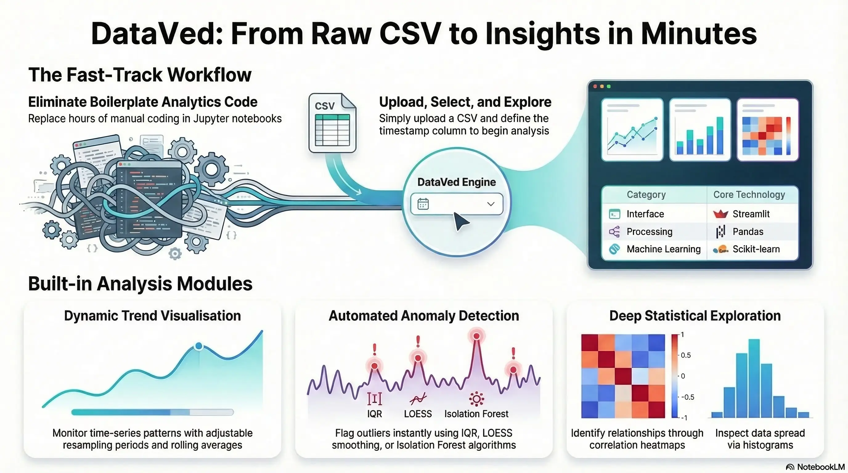
The Idea Behind DataVed
DataVed is a lightweight Streamlit-based analytics dashboard for exploring time-series datasets without writing code. The workflow is intentionally minimal.
- Upload a CSV
- Specify the timestamp column
- Start exploring the data
That’s it. No setup. No boilerplate code. No notebooks to maintain. The goal is simple:
Make exploratory analytics fast enough that you can do it the moment new data arrives.
This turned out to be extremely useful internally, especially when validating incoming IoT datasets or investigating unexpected system behavior.
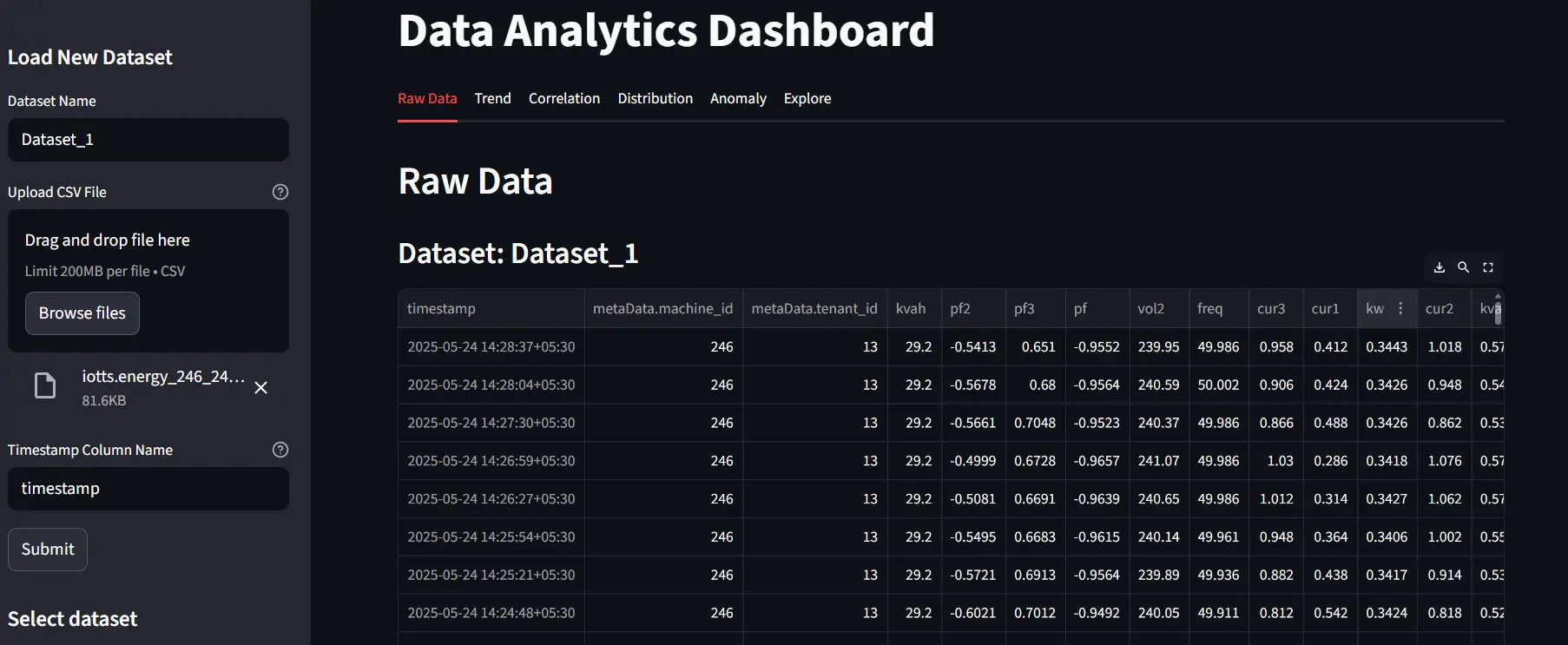
Upload and Inspect Raw Data
Everything starts with a dataset upload. Users provide:
- A dataset name
- A CSV file
- The timestamp column
The dashboard immediately loads the dataset and displays the raw data. This step sounds trivial, but it is often where many problems surface:
- incorrect timestamp formats
- missing values
- unexpected column types
Seeing the raw dataset immediately helps catch these issues early.
Exploring Trends, Correlations, and Distributions
Once the dataset is loaded, the next step is understanding how the variables behave. DataVed provides built-in visualizations for three common exploratory tasks:
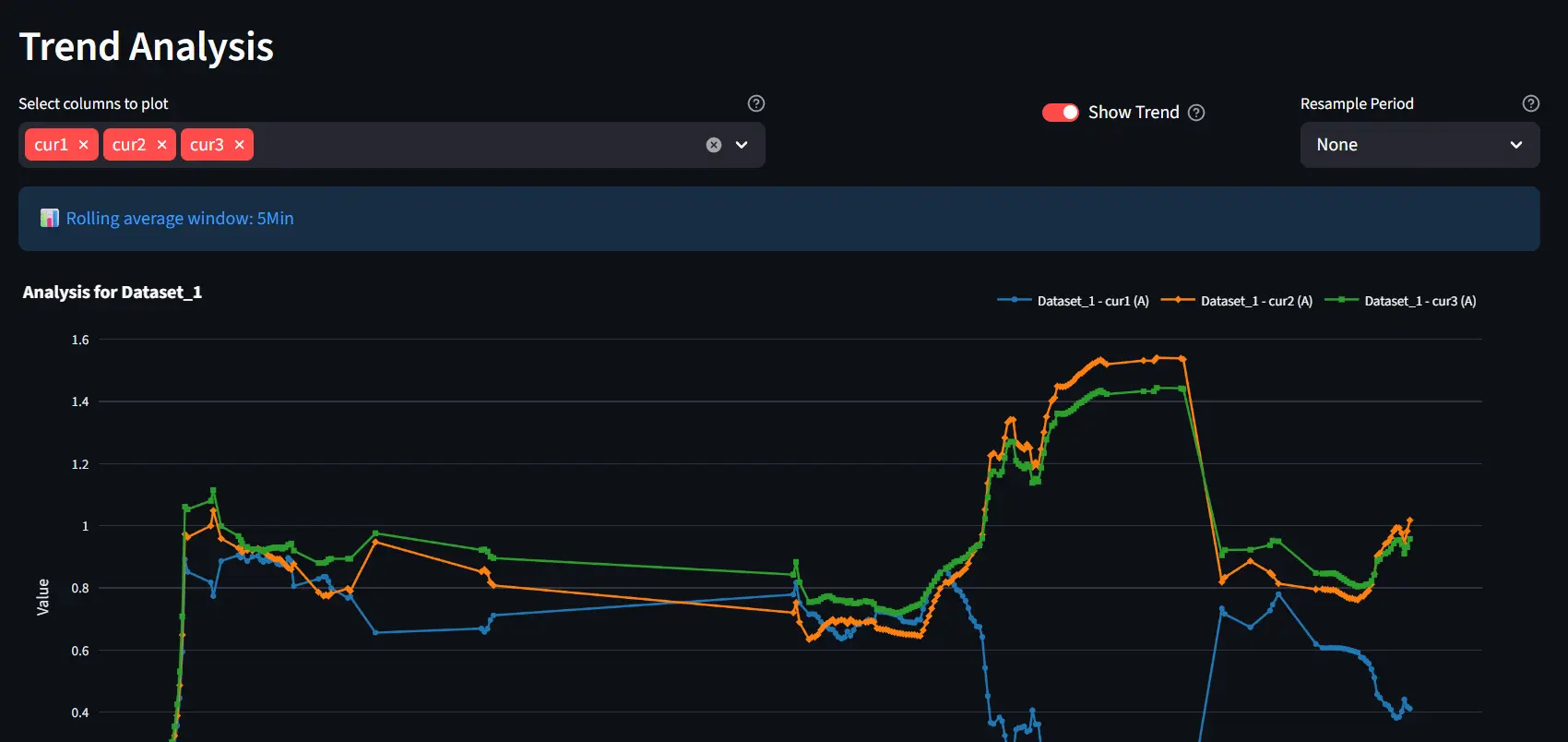
Trend Analysis
Time-series plots allow users to visualize how variables evolve over time. Features include: time-series plots, resampling of data, and optional rolling averages
This is particularly useful when working with noisy sensor data.
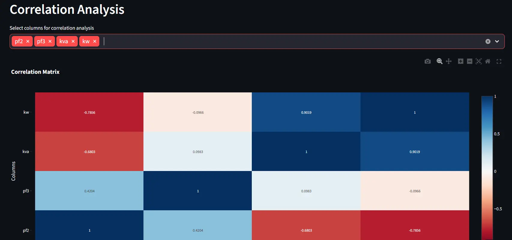
Correlation Analysis
Correlation tools help reveal relationships between variables. Users can quickly generate scatter plots for 2 variables or correlation heatmaps more variables.
Unexpected correlations often reveal hidden system behaviors.
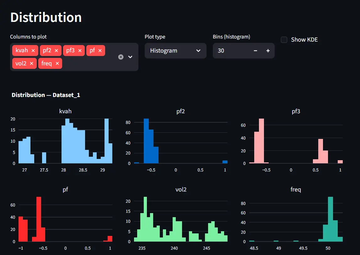
Distribution Analysis
Distribution plots help understand the statistical behavior of variables. Available visualizations include: histograms, KDE plots, and box plots
These are useful for identifying skewed distributions or unusual values.
Together, these views provide a quick but comprehensive understanding of the dataset.
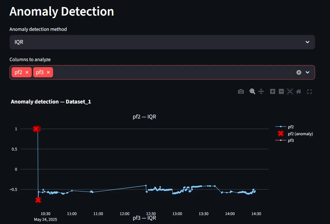
Built-in Anomaly Detection
DataVed also includes simple anomaly detection tools. These rely on well-known out-of-the-box statistical methods, including:
- IQR-based outlier detection
- LOESS smoothing
- Isolation Forest.
These techniques are lightweight and effective for quick exploratory analysis.
However, more advanced anomaly detection approaches are possible. In many industrial systems, including Zolnoi product anomaly detection utilize segmented time-series to learn normal behavior patterns using advanced transformer architectures. DataVed does not attempt to implement these complex pipelines. Instead, it focuses on quick anomaly discovery during exploration.
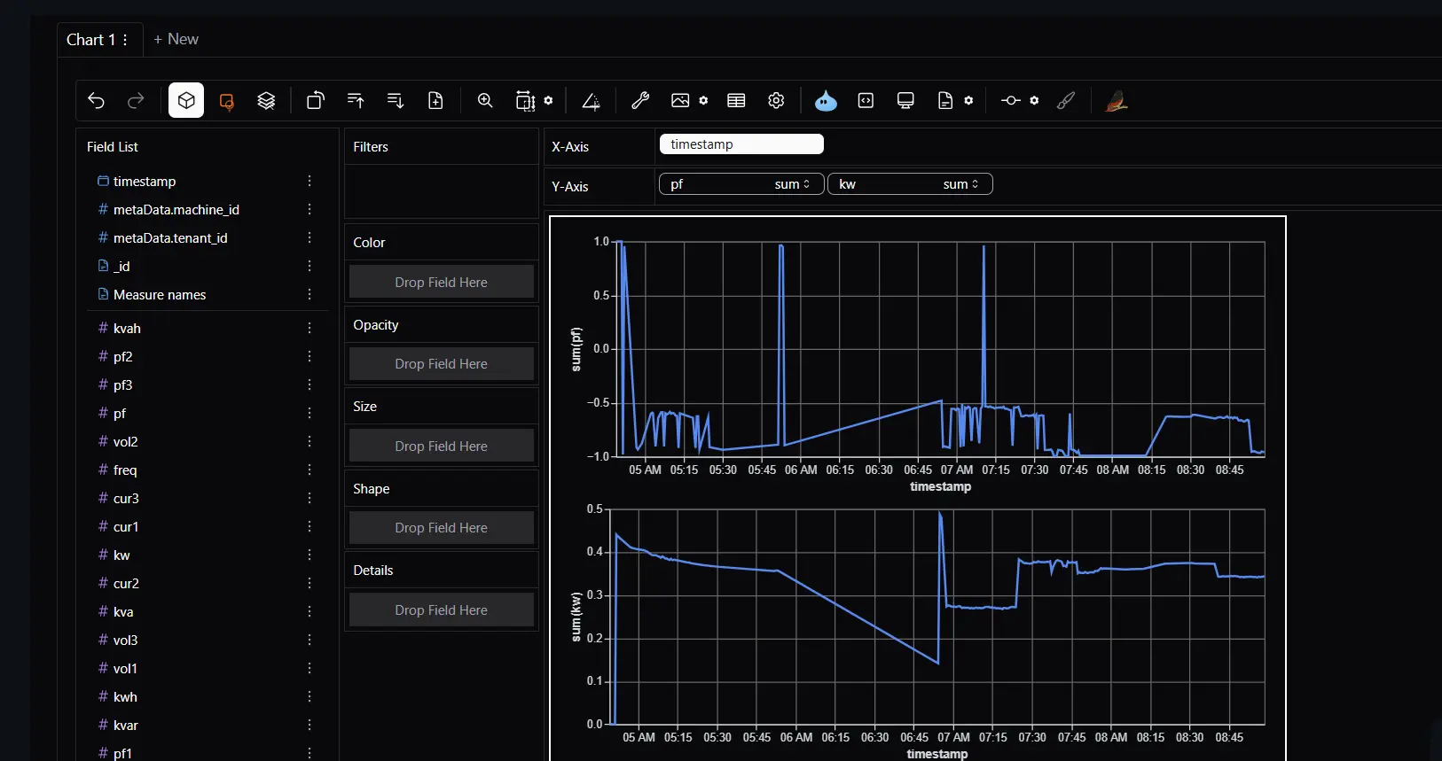
Deeper Exploration with PyGWalker
For users who want more flexibility, DataVed integrates PyGWalker.
This library provides a drag-and-drop visual exploration interface similar to Tableau.
It allows users to:
- create charts interactively
- explore relationships dynamically
- build visualizations without writing code
This becomes particularly useful when you are still in the “let’s see what the data says” phase.
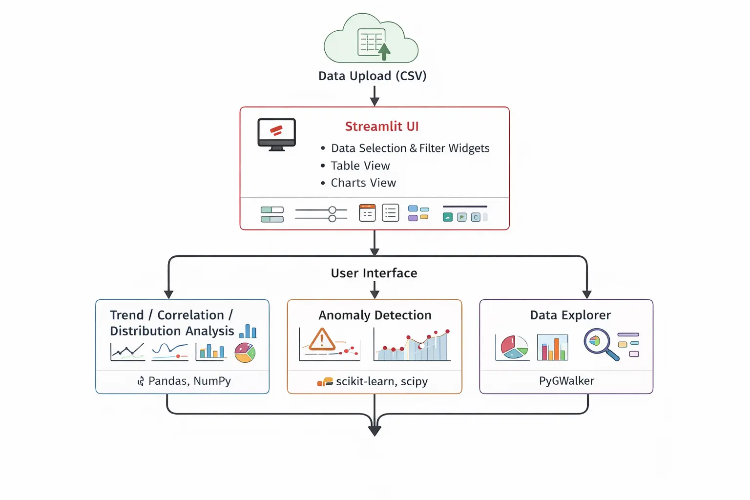
Technical Architecture
The architecture intentionally keeps things simple. At a high level the system consists of:
- Streamlit → application interface
- Pandas → data processing
- Visualization libraries → charts and plots
- Scikit-learn → anomaly detection
- PyGWalker → interactive exploration
The goal was to keep the system easy to deploy, easy to extend, and easy for contributors to understand.
How AI Helped Build This Project
AI also played a role in improving this project. After the initial version of the application was working, I used Cursor AI to enhance several aspects of the repository. AI assistance helped with:
- restructuring parts of the codebase into cleaner modules
- generating test scripts
- improving the README documentation
- adding licensing and repository structure
- setting up GitHub action workflows
- integrating PyGWalker more cleanly
Even this project write-up benefited from AI assistance in refining the structure and clarity. AI didn’t build the project — but it definitely accelerated its evolution.
Challenges: Managing State in Streamlit
One of the trickier parts of building the application involved state management.
Streamlit re-runs the entire script after every interaction. This makes development simple, but it also means that uploaded data can disappear unless it is stored properly. To prevent repeated loading and recomputation, the application stores datasets in Streamlit’s session state.
Example pattern used in the project:
if "datasets" not in st.session_state:
    st.session_state.datasets = {}

if dataset_name not in st.session_state.datasets:
    st.session_state.datasets[dataset_name] = df
This ensures datasets persist across interactions and different tabs within the application. Without this approach, the dashboard would constantly reload datasets.
Future Directions
There are several areas where DataVed will continue to evolve.
-
Better handling of large datasets: Currently the application processes data in memory using Pandas. Very large CSV files can therefore become slow to load and analyze. Improving scalability is an important next step.
-
Improving UI interactions: Some UI widgets (such as multi-select dropdowns) occasionally require selecting the same option twice before changes take effect. This behavior arises from interactions between Streamlit’s reactive model and session state. It will be refined in future versions.
-
Expanding analytics capabilities: Potential additions include:
- additional time-series analysis tools
- better anomaly detection modules
- integration with additional data sources
- natural language based data exploration
Key Takeaways (TLDR;)
If I had to summarize the project in a few points, they would be these:
- Exploratory analysis is often repetitive and time-consuming
- Many datasets require the same basic visualizations
- DataVed reduces the time to explore a dataset to just a few minutes
- The tool was built for internal use first, then open-sourced
- AI tools helped accelerate the polishing and evolution of the project
Most importantly:
The goal is simple — make data exploration fast and accessible.
Closing Thoughts
DataVed started as a small internal tool built out of frustration. Not with complex analytics problems — those are interesting.
But with the repeated effort required just to start exploring new data.
If the tool helps someone go from raw data to insight faster, then it has already served its purpose. You can try the live app here:
https://dataved.streamlit.app/
And explore the code here:
https://github.com/SivamPillai/dataved
Contributions and suggestions are always welcome.
Related from the thinking lab
Other things connected by tags — essays, projects, quotes, notes, and collections.